My Twitter is on New Twitter
Today Twitter is doing massive interface upgrade on their iOS ,Mobile Web , Web , Android clients, from what I can see the iOS and Mobile Web version seem like identical , but so far base on the conversion on my twitter, it seem like lots of negative feedback.
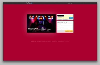
But I like the web version interface so far , in stead of cartoonish like last time , now is looks like a more polish product, below the new twitter login/sign-up page, looks stunning right ?
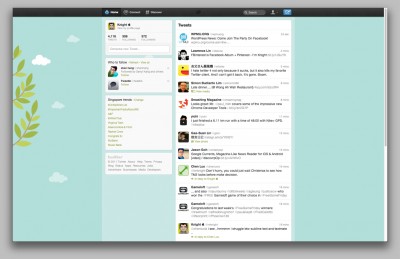
and this is the actual interface after you login. You have 3 tabs on top , Home, Connect and Discover.
- Home – this is the default page of your twitter , it’s reverse from the old version, now the tweets is on the right and the left navigation will be your account info, trends and recommendation.
- Connect – this include both interactions and mentions, interactions seem like include mentions and who has follow you recently.
- Discover – Stories seem like popular topic , activity is about what happen on the person you follow , recommend who to follow, find friend and Category all under this tab.
So far do you like the new Twitter ?


