Goodbye Brizzly Hello #NewTwitter
I didn’t use any desktop application for Twitter so far , I refuse to keep receive notification by Twitter on every update , I prefer to read the tweets when I feel like to , that’s why I been using Brizzly as my twitter web client.
This explain why I like the #NewTwitter , it looks like a new web client for Twitter and enhance the User Experience and Usability too.
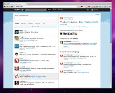
As you can see the #NewTwitter Interface become 2 column , on the left will be your usual timeline, on the left it will show the related info on the highlight tweets, example user’s bio that mention in the tweets , tweets that mention about the user and the latest tweets from the user, user that reply this tweet, user that retweet this tweet and etc.
If only Twitter is adding the preview feature, which mean if is an image url, the smaller version image will show on the right column, if is a shorten url, it will expand to the actual url on the right column, if is a video url , you can just play it on the right column.


