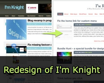
I’m Knight v12 ready
I didn’t post any proper update about the revamp for this blog for some time , the last post I have is about v9 during 2008, I did try to have a major upgrade end of last year but it doesn’t seem like a success.After preparation of few week , today I would like to announce I’m Knight v12 is ready.
The basic structure of this new design is using Woo Theme‘s Canvas Theme , I have created a child them base on Canvas and putting my limited design idea to create some thing different , If you been visit this blog for the past few week , you might even see the blue theme Canvas on trial but in the end I still back to white background to adopt the minimalist design with lesser color used.
So what are the changes ?
Google Font API
Check out the header that I actually using the Google Font API to style the blog title , you can check out the font preview before apply on your own blog.
CSS 3
There are few CSS 3 trick that I m using on this new design, example like rounded corner , text shadow and box shadow.
Sharing
For encourage reader to share the content , instead of having all the sharing link at the end of content, I m trying the floating share bar plugin.
Comment
Interaction is one of the major thing for a blog , I have added comment luv and subscribe to comment to improve user experience for commenter, I’ m still wondering shall I remove the No Follow for comment.
Let me know if you have any suggestion for this new theme ? I m welcome any feedback.


